

LowCost Travel Group
Rebranding and optimising a one-stop travel site
Product designer & researcher
Permanent (2015-2016)
Background
LowCost Travel Group comprised of 2 travel and accommodation brands which won numerous travel awards and had been challenging traditional travel operators by providing better value holidays for everyone at low cost prices. I joined them as they broadened their territories from 14 to 47 countries.
Opportunity
LowCost Travel Group had the opportunity to broaden their market by moving into 33 new countries. They decided a rebrand was required to rejuvenate their site and make it more appealing to an international audience. Internationalisation of the site and its payment pages were critical as well as the optimisation of their mobile experience.
Who I worked with
Product director & manager
Head of brand & marketing
Head of development
Sales and trading managers
Business analyst
Development scrum master and team
Solution
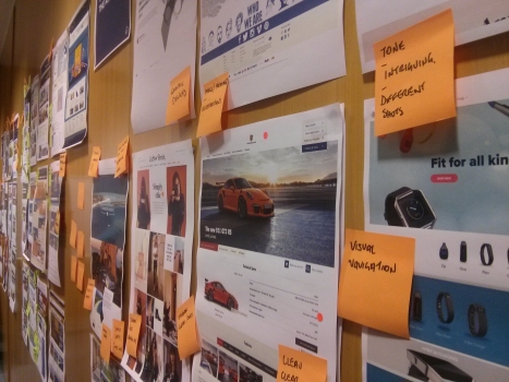
The discovery phase consisted of research into the existing brand compared to our competitors. I interviewed users in Gatwick airport as well as running unmoderated feedback sessions where we gathered consumer feedback on impressions about the brand and the UI. I also interviewed internal stakeholders to uncover the history and failings of the brand implementation. We ran workshops with SLT to gather and discuss the feedback so we could feed this into a brief and initial concepts.
I sourced and managed a brand designer (https://studiokidd.com/) who helped define a logo, colour palette and typeface which I then extended into a digital style guide covering desktop and devices. These were rolled out to page designs and together presented to our development team so we could start to plan it’s delivery.
"Ben is an absolute pleasure to work with. He's equally at home innovating as he is optimising existing experiences. He conducted one of the most thorough pieces of research into payment page best practice I have ever come across - and it worked! He has a natural capability of drawing the most out of user interviews and getting to the heart of a problem. He also single handedly designed a new brand website for us from the ground up. He's also a thoroughly nice guy to work with. He's firmly on my list of people to look up when I need UX expertise in the future."
David Jonnes (Product director)
The final rebranded and responsive product
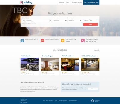
The homepage
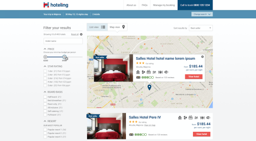
The hotel listings page
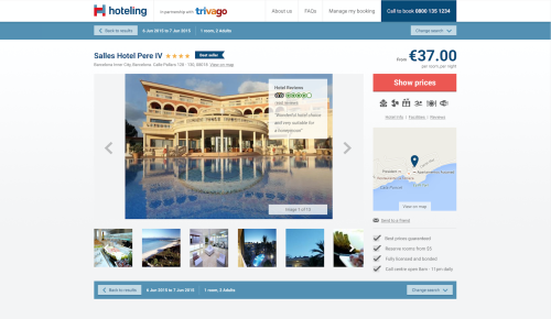
The hotel page
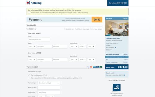
The payment page
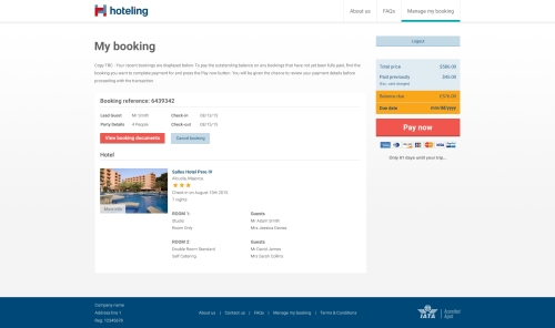
The booking admin page
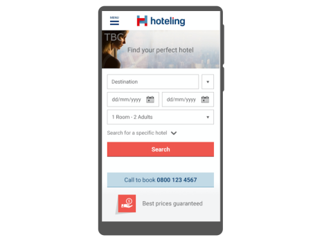
Mobile version of the homepage
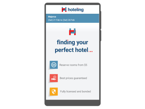
Mobile loading screen
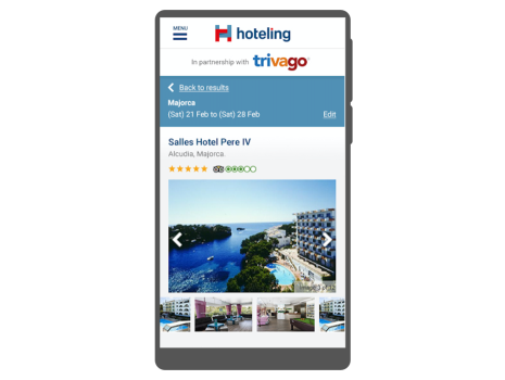
Mobile hotel page
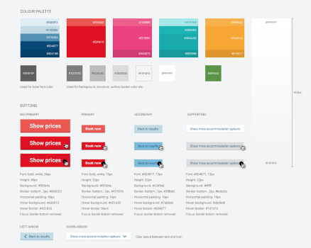
Styleguide 1/3
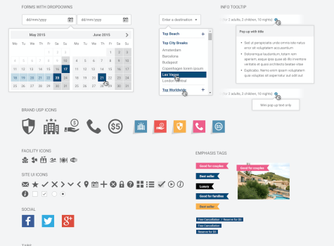
Styleguide 2/3
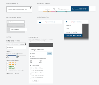
Styleguide 3/3
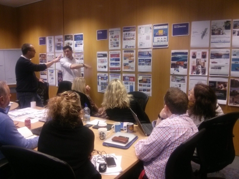
Leadership team workshop where we critiqued the brand and website against competitors (co-presented with James Jack)
Leadership team workshop where we critiqued the brand and website against competitors
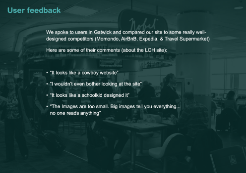
Qualitative feedback from our users
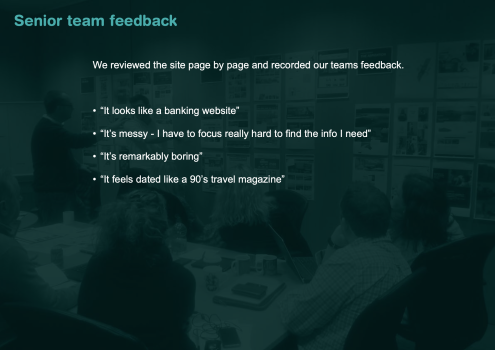
Qualitative feedback from our team
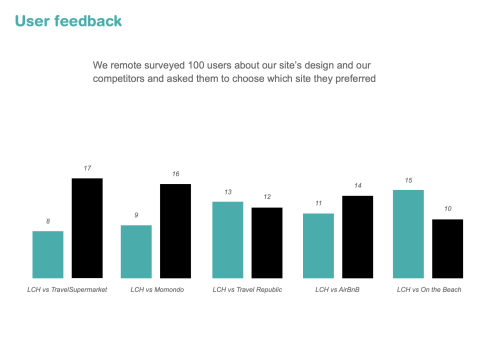
Unmoderated test results comparing our existing site UI to competitors
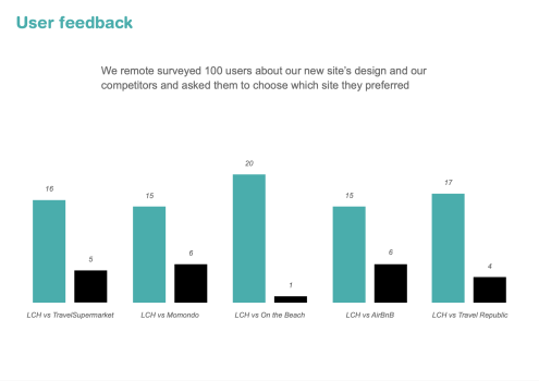
Unmoderated test results comparing our new site UI to competitors
Key activities / projects
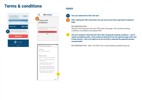
Payment page research & redesign
The first key project that we rolled into the rebrand was the overhaul of the payment process. Metrics indicated a worrying drop-off rate which we needed to improve. I conducted a discovery phase where we gathered metrics and spoke to fraud, payment and customer service teams. I user tested and watched Hotjar recordings of the payment pages to uncover the causes for the drop-off.
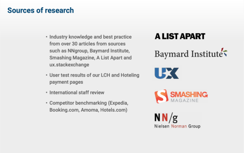
I also researched the best practices of eCommerce payment pages, focussing on internationalisation. Armed with this research I presented a report and critique of the existing pages and proposed a redesign. I later adapted the report and presented it as “The anatomy of international payment pages” at the monthly UX Brighton meet-up which you can watch on YouTube https://www.youtube.com/watch?v=cwhX8TMM8Eo.
A research phase covering industry best practices of international payment pages
Desktop research was undertaken from industry leaders
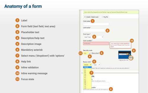
Informing the team about standard form nomenclature
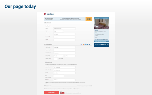
The existing payment pages being critiqued
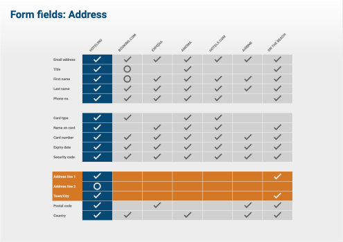
Comparing the number of questions with competitors sites (and whether they were required or optional)
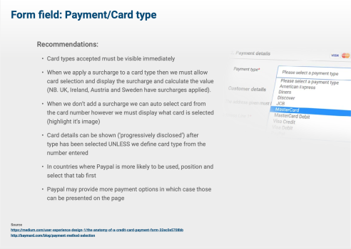
Recommendations made from best practices
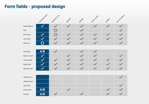
Proposing the new (and reduced) payment question set
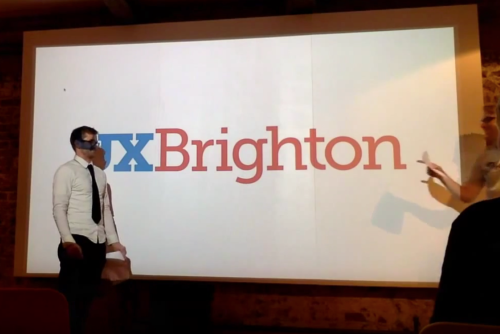
I presented a version of the research at the monthly UX Brighton meet-up
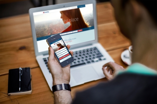
Mobile design & usability testing
Before joining, there hadn’t been much focus on the mobile experience and metrics/sales were showing this. To uncover the key issues I organised and ran mobile user testing sessions which were analysed and reported on so we could optimise the experience.
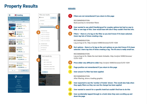
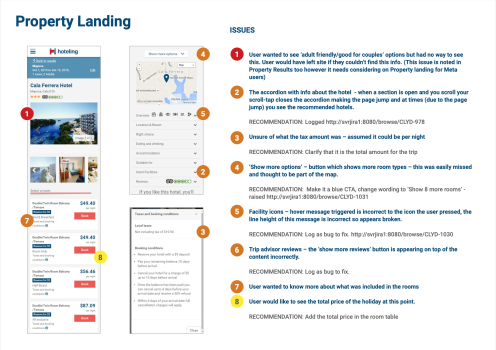
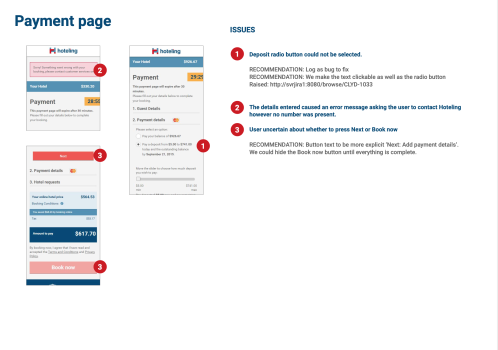
The usability report for mobile user testing
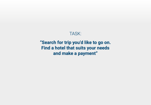
Setting the context with the core user journey we tested
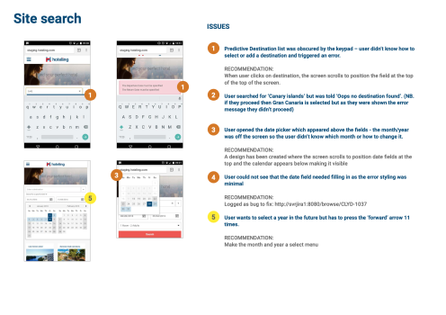
Reporting high, medium and low priority findings
Reporting high, medium and low priority findings
Reporting high, medium and low priority findings
Reporting high, medium and low priority findings
Reporting high, medium and low priority findings
Lessons learned
- Around the time, brand guidelines sorely lacked a focus on digital implementation. A lot of work is required to appropriate them into a UI and make them interactive.
- Befriend your development team! Due to the additional usability projects we brought in scope, the project took months to deliver. Maintaining a good relationship with the Scrum master and developers was key to keeping us on track and motivated. I presented user feedback recordings on Fridays where we gathered with a few drinks to see how our work was being received.
- Practise presentations. Delivery is key and overcoming nerves whilst presenting can be reduced by knowing your material inside out. I meticulously practise presentations so when the big day comes they feel relaxed and knowledgeable.